Zoom Website Concept
Illustration | Website Design | UI/UX
Client
Algonquin College—School Project
Goal
Take an old project that you’ve done and revamp it using the skills you’ve gained.
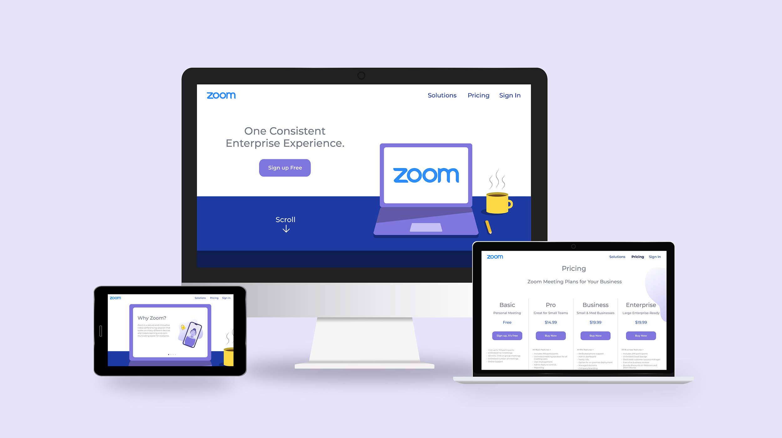
For this project I decided to revamp an old assignment where I designed a website prototype for the official Zoom website. I wanted to redo this project because my old version of the site was plain, text heavy, and the colours were very bland and boring, and I knew that I could make it much nicer than the old version.
Old Version
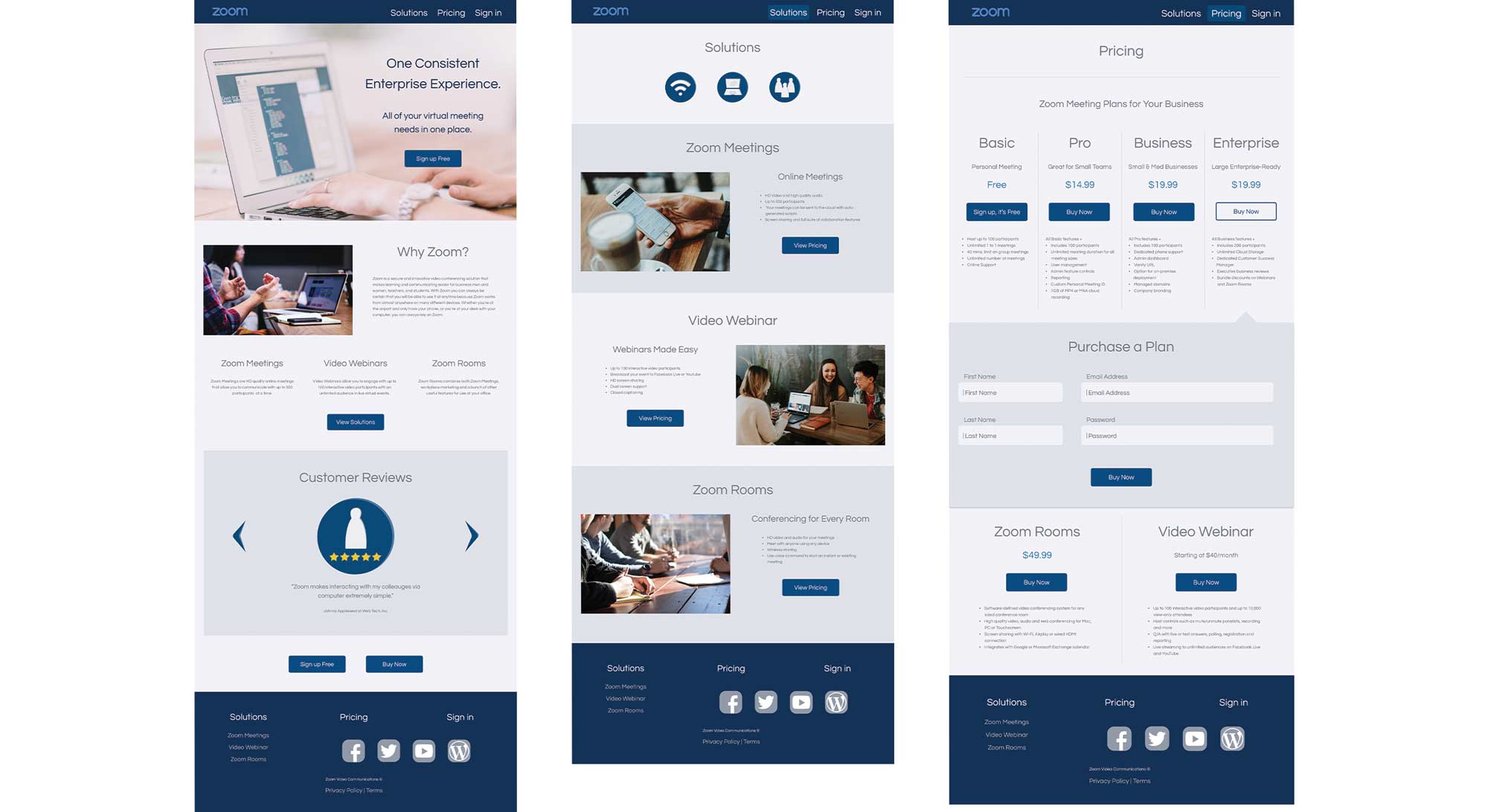
Right off the bat this project was very tricky for me. I had a hard time thinking of how I could effectively improve the site. I wanted to do something that was more innovative than just changing up the colours and images, but still intriguing and eye catching for users.
Sketches
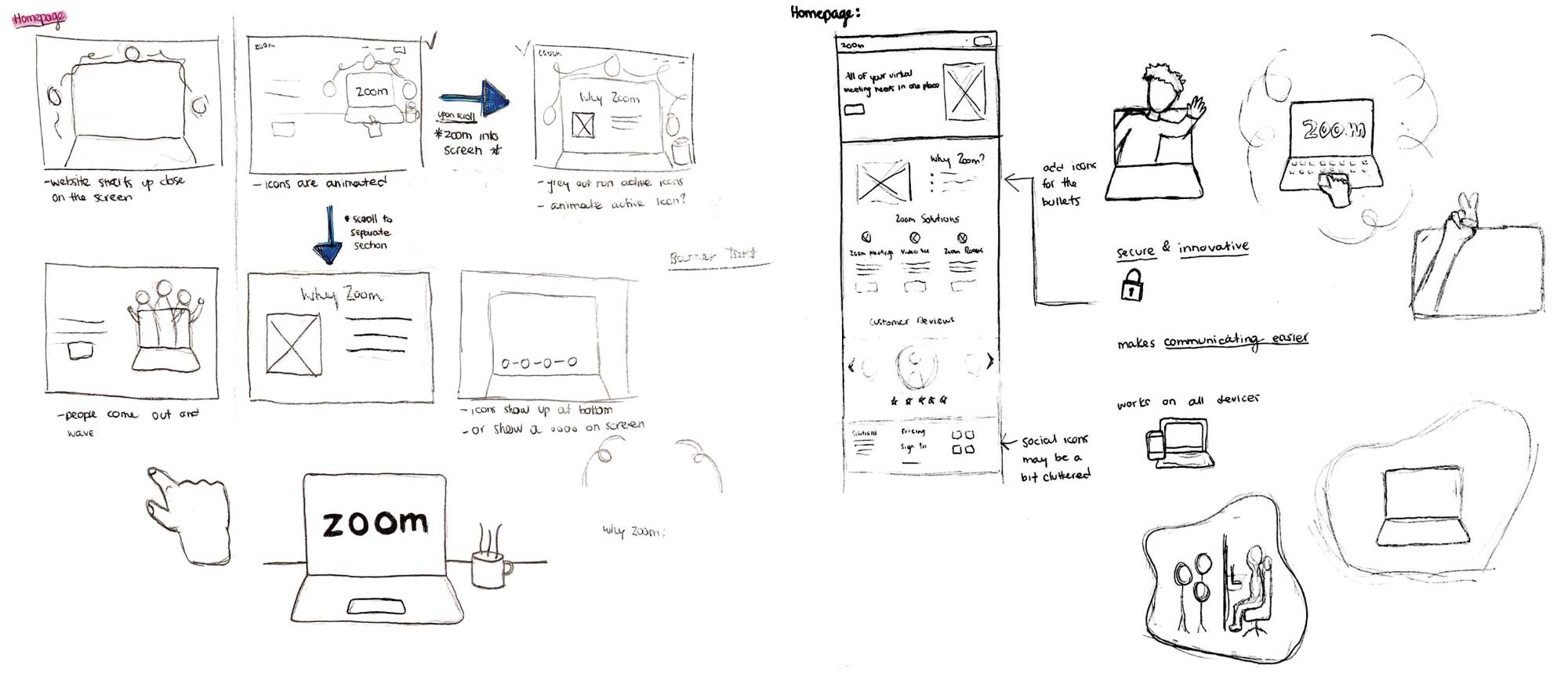
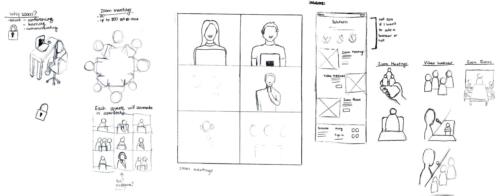
That’s how I came up with the idea of scrolling through a computer screen. I chose to have the website work through the visual of a computer screen because I wanted it to be like the act of scrolling through an online app. I wanted the user to be placed into the on-screen visuals and actually be able to interact with/control the main element that was on the home screen—the monitor on the desk.
With this project I went through many rounds of sketching and trying to figure out how I wanted the illustrations to look. After working on paper for a while with very little luck, I switched to the computer to see if I could think of any that way. I was able to produce some good ideas that I thought fit very well with not only what I was trying to go for, but also Zoom’s overall brand itself.
Process
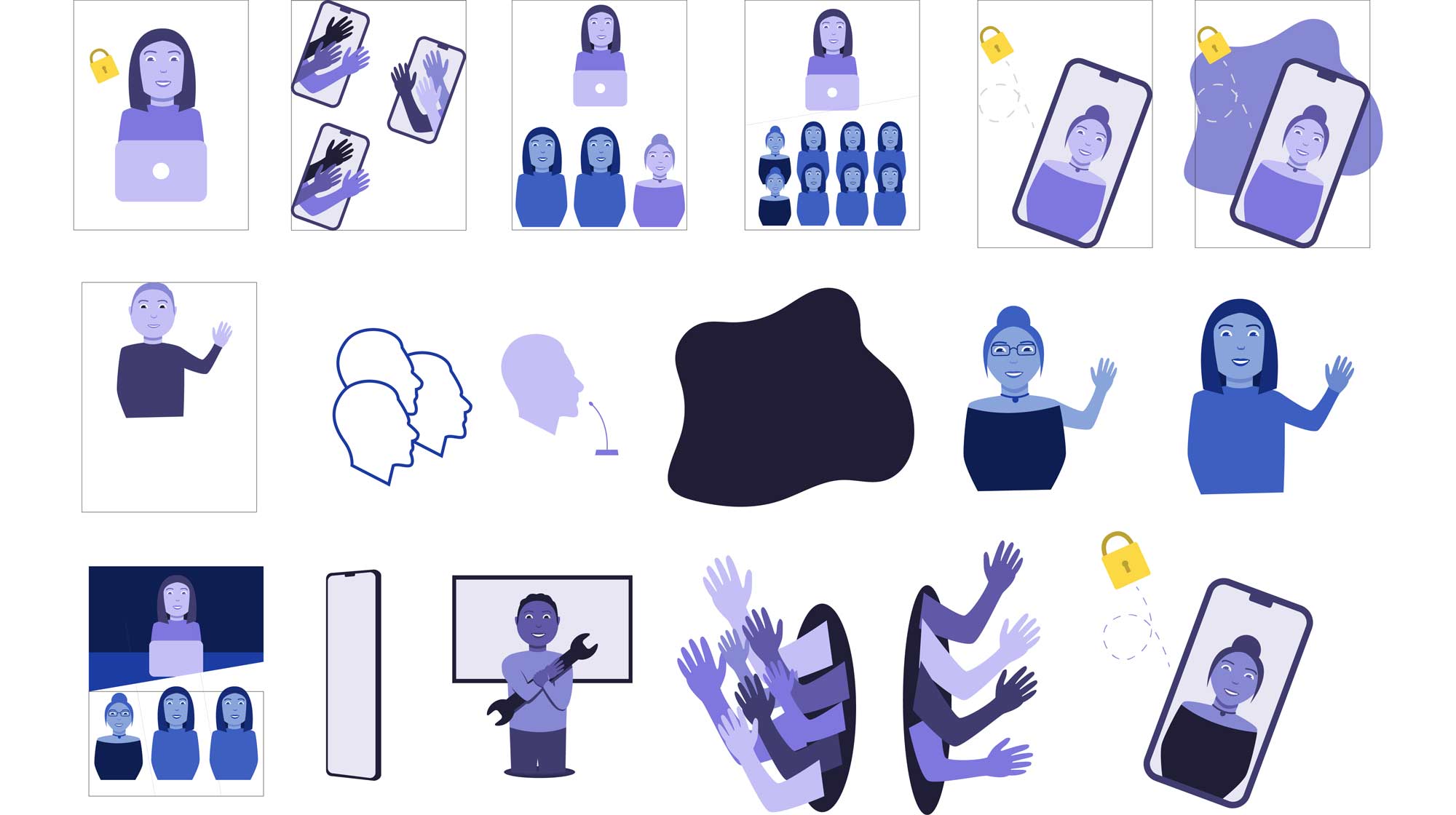
These are some of the extra elements that were made during the design process.
Final
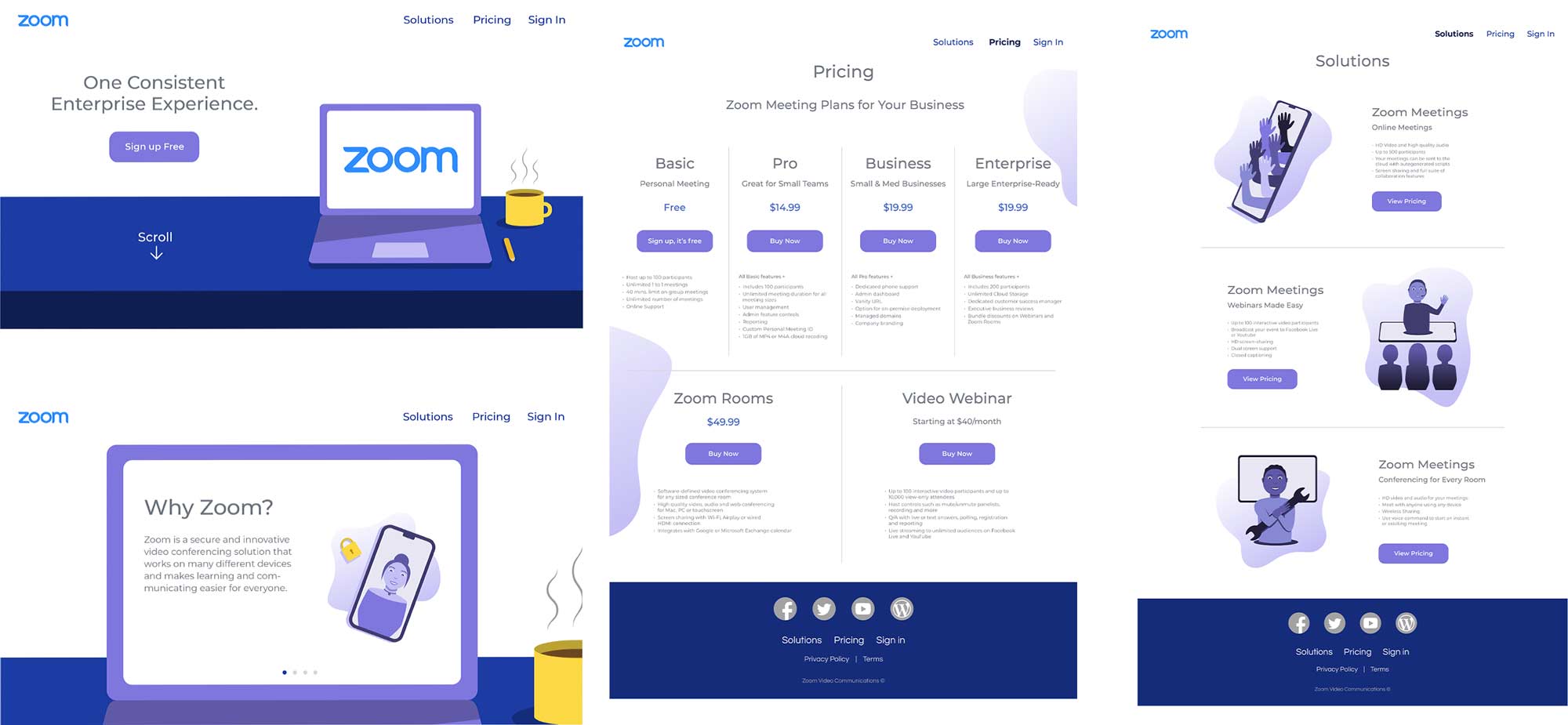
Animated Interface
Challenges
My challenge throughout the beginning of this project was that I had no idea how I wanted the illustrations to look. It took a lot of experimentation to figure out what to do, but it allowed me to explore quite a few different styles.