Compassionate Ottawa
Branding | Website Design | UI/UX
Client
Compassionate Ottawa
Goal
Design a new logo and upgrade the website to make it easier to navigate, as well as, make the overall experience on the website more appealing for younger audiences.
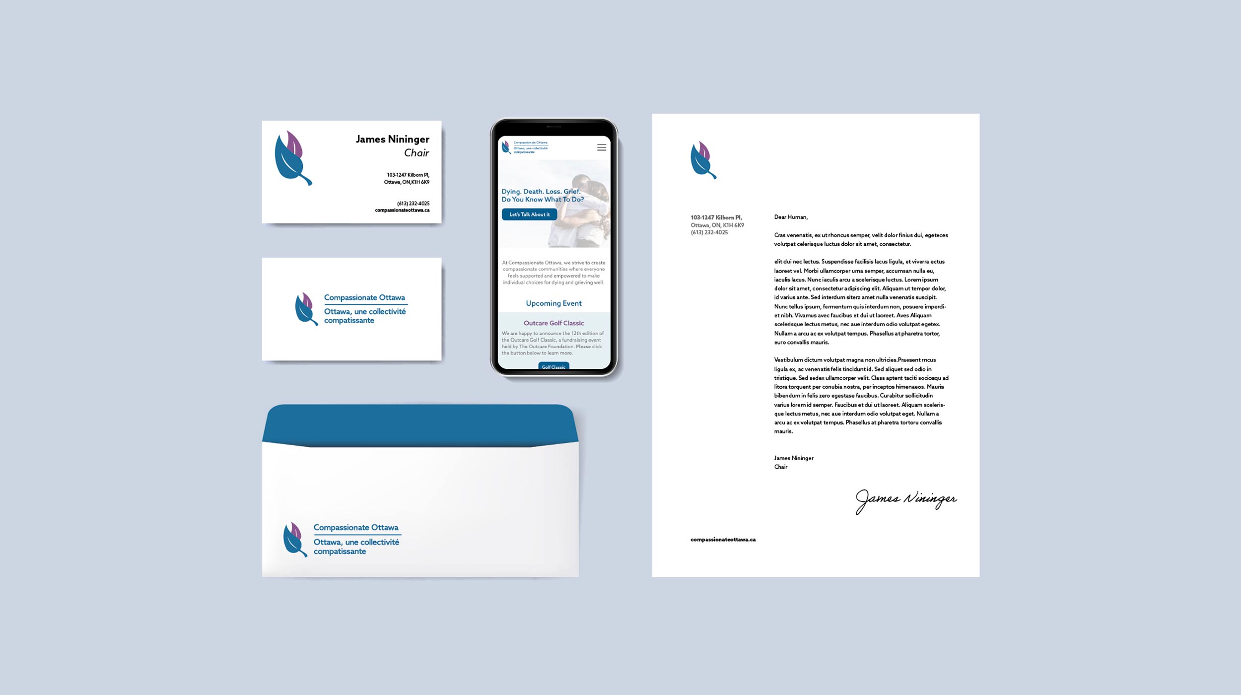
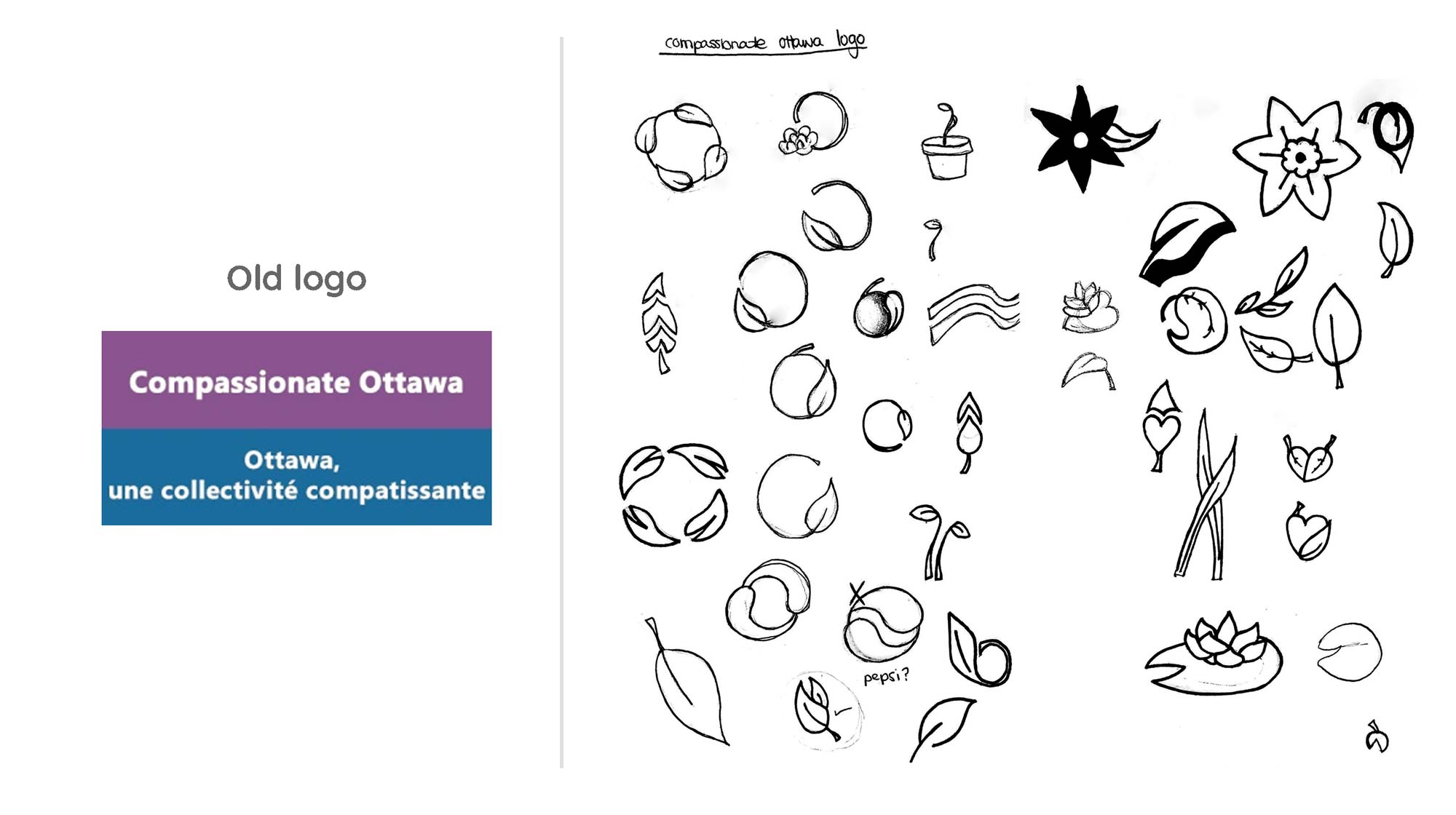
Compassionate Ottawa is a non-profit organization that promotes changing the negative narrative around death, dying, and grief. So, when working on the logo I really wanted to focus on the aspect of life—but more specifically I wanted to focus on the cycle of life as opposed to death or dying. I wanted the logo to be lively and represent a celebration of life. Therefore, I incorporated leaves into the logo because leaves are in an endless cycle of renewal—they grow, change colours, fall from the trees, and then the cycle repeats. The same thing happens with people, except we grow from babies, to toddlers, to adults, to elders, and our children/family members carry on our legacy. The leaves in the logo are also in a hugging embrace to give that feeling of warmth also signifying that you’re not alone when dealing with these types of situations.
Logo Design
Sketching Process
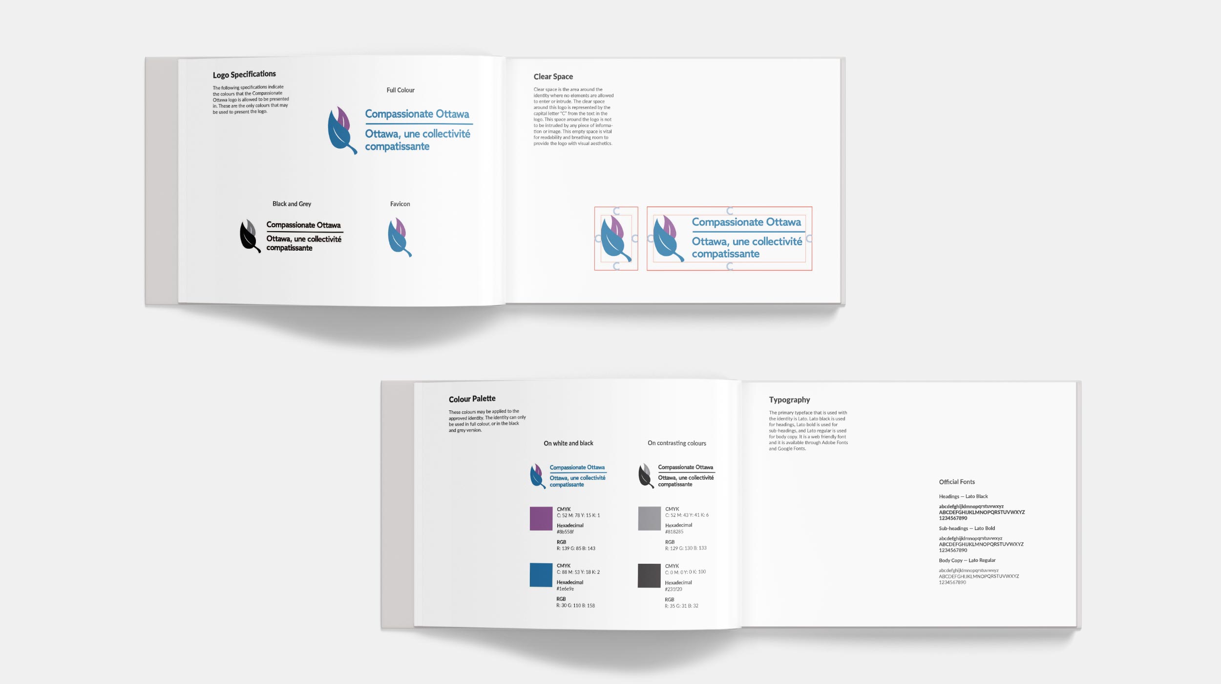
Final Logo
Website Design
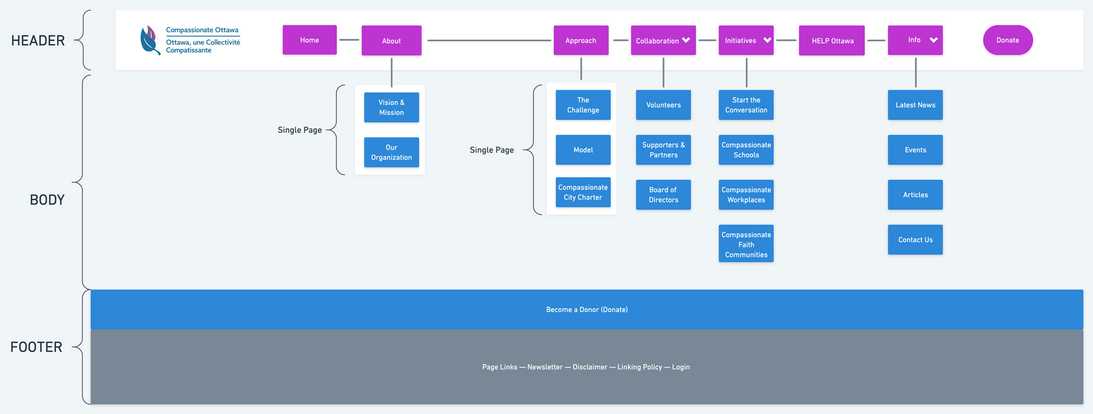
The website portion of the project was done with the help of my two teammates. The first thing we did was change up the navigation and make a new sitemap.
Sitemap
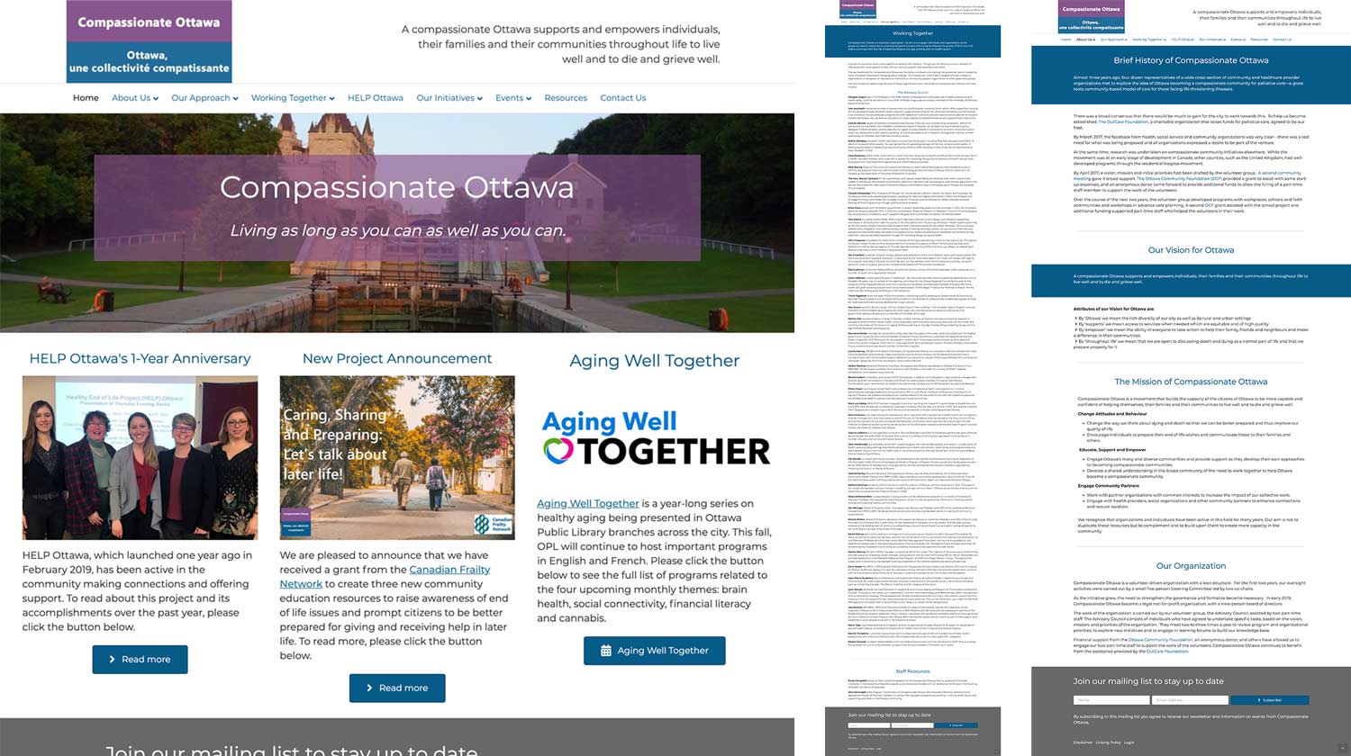
My teammates were responsible for rewriting the content for the new Compassionate Ottawa website and once they were done, I made the website wireframes to match Compassionate Ottawa’s new brand. Their old website was overly text heavy, lacked images, and lacked white space. I wanted to breathe some personality into the new website with icons, and happier/more personal imagery. I also incorporated more white space so that it’s not overwhelming or confusing when someone goes to the site.
Old Website
Wireframes Process
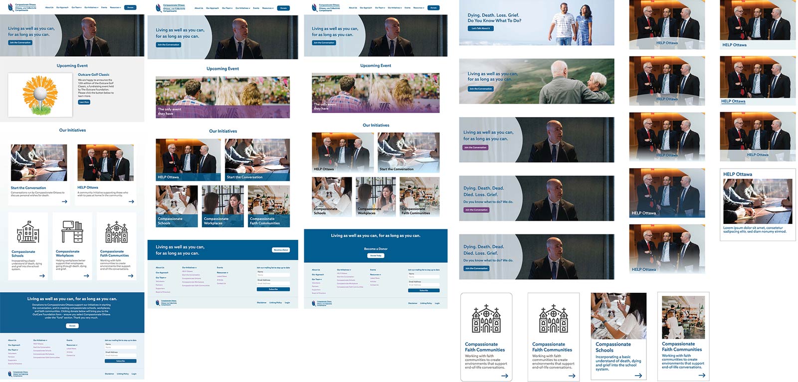
Here are some of the things that were made in the process of brainstorming new elements for the website.
Final Wireframes
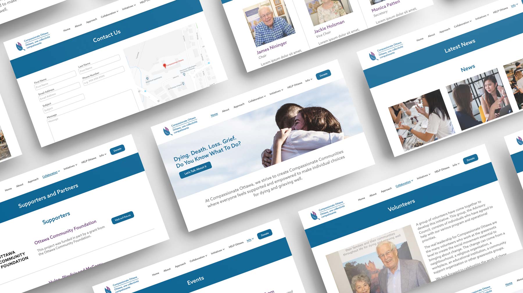
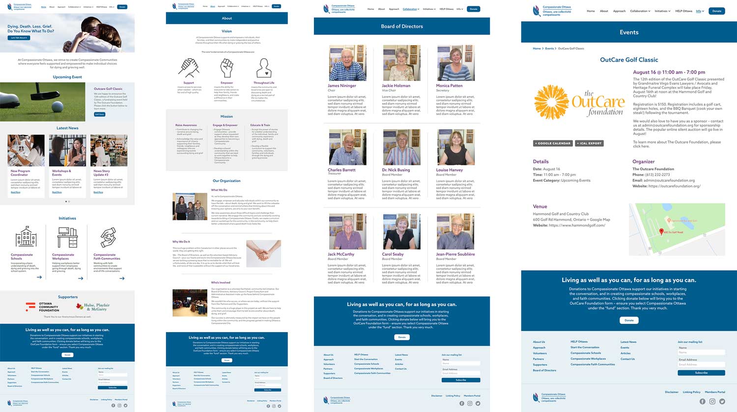
These are some of the new pages. More white space is included to allow for easier reading.
Challenges
Our clients really loved the colours of their old logo (blue and purple), so I had to make sure to use those colours throughout the website design and logo. The biggest challenge was making sure that whatever imagery was used in the logo looked good in both blue and purple, and ensuring that I didn’t overuse their brand colours in the website design.
Disclaimer: The clients have not yet implemented the logo or the website design.